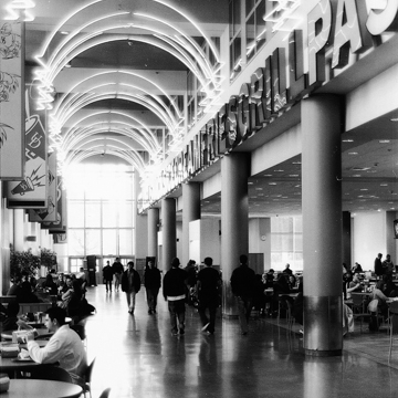
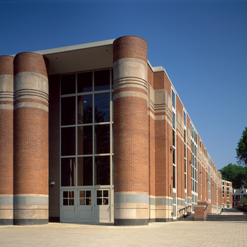
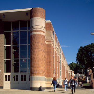
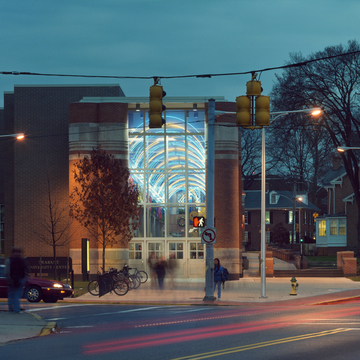
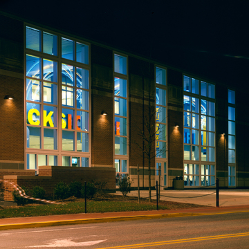
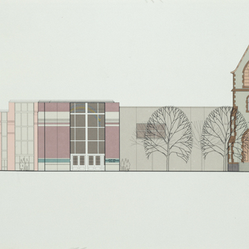
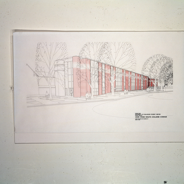
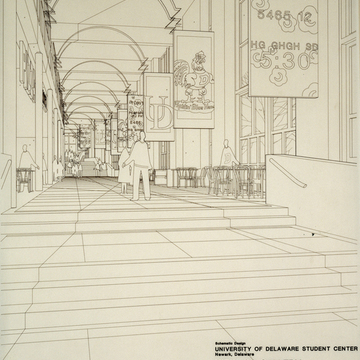
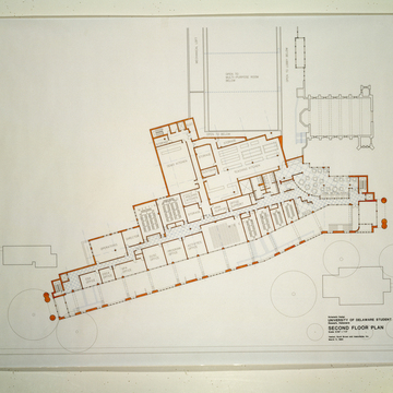
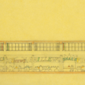
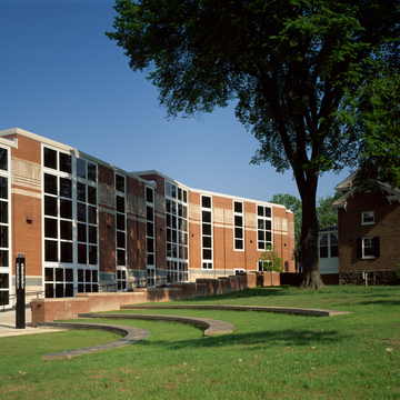
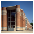
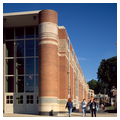
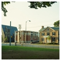
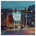
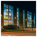
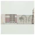
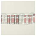
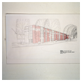
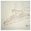
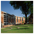
When a previous student center (1957) proved inadequate for a greatly enlarged enrollment, a new one was planned closer to the westward-shifted geographical heart of campus. Five architectural firms competed, and the famous Philadelphia group VSBA (see Flint House, CH7) won with this design that incorporates a kind of indoor street, as at their Seattle Art Museum (1991). Its angled direction follows a preexisting student shortcut. The food court and shops are mall-like and huddle beneath a long, colorful row of oversized and glowing plastic letters that spell PIZZA DELI SNACKS FRIES, etc. Blue and gold neon lights (the University colors) buzz overhead, giving the illusion of a vault. “We really like the fact that it is just a little vulgarly commercial in there,” said the architects (Kershaw, 2001). Outside, the long descending arcade is marked by a deliberately complex arrangement of pilasters with wide-mullioned windows between, the whole creatively extrapolating from the brick Georgian Revival aesthetic of the rest of the campus. At either end, three mega-columns are in essence signposts that shout “Entrance,” amusing in their unwarranted bombast and in that they support only the slenderest of roof slabs.
Opinions about the design were divided. Admirers cited the building's intelligent accommodation to the many complex functions of a modern student center, even as it nodded to colonial traditions and incorporated the old Gothic Revival church, Daugherty Hall. (Similar virtues were evident at other university student centers of the 1990s by these architects at Pennsylvania, Princeton, and Harvard.) They also enjoyed its witty play with a wide range of allusions, from American Main Streets (the arcade) to the Greek Parthenon frieze (the row of letters) to the architects' own design for Guild House (1960–1963) in Philadelphia (the fat columns). Detractors complained, however, of the jarring termination of the arcade at its roofline and where it meets the barren rear elevations and at the undignified, carnival atmosphere of the neon interior—which was, the architects admit, deliberately designed to please students, not their elders.

