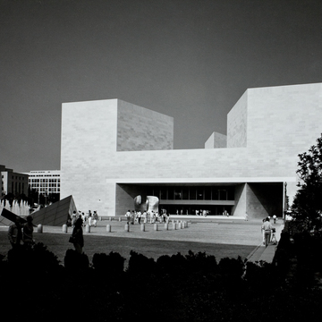
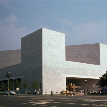
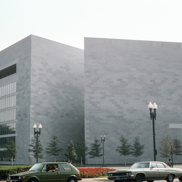
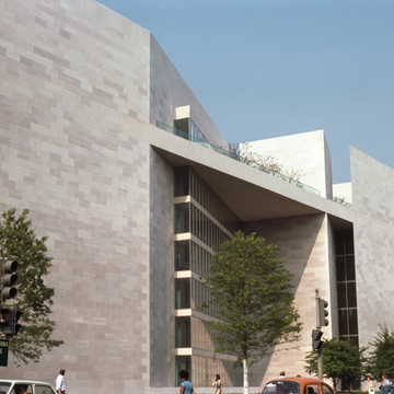
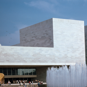
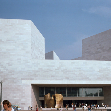
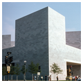
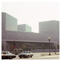
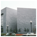
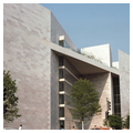
Trustees of the National Gallery of Art commissioned I.M. Pei in 1968 to design an extension to an existing museum. The challenge was to create a structure that would emerge organically from the awkward trapezoidal site and contribute a modern kind of monumentality to the neoclassical Mall. The new architecture was meant not only to challenge the aesthetic continuity of the Smithsonian’s architecture, but to also transform its functions by privileging public programming and access. Indeed, Pei invoked the plan of the site, conceived by L’Enfant and consolidated by the McMillan Commission, as a symbol of American democracy. The building was therefore woven into the fabric of the city and the idea of the national capital itself.
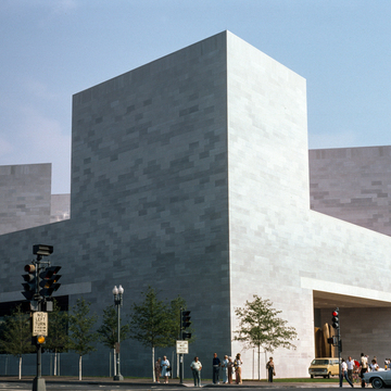
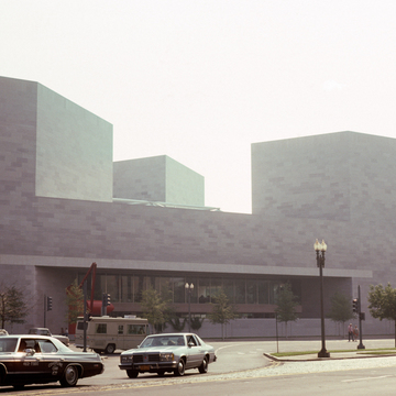
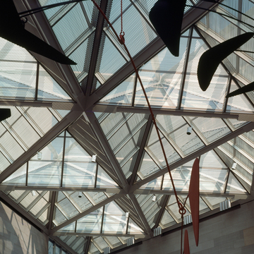
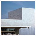
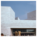
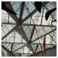
Pei's East Building addition to the National Gallery of Art is a complex interweaving of two- and three-dimensional geometries. The entire structure is a trapezoid, a form dictated by the 8.8-acre site just west of the apex of the triangle where Pennsylvania Avenue converges with the Mall. In plan the trapezoid is formed by an isosceles triangle (the museum) and a right triangle (the Center for Advanced Study in the Visual Arts). The separation of these two forms is evident at the southwest and northeast corners where a skylight spans an external corridor between them, creating a tenuous connection between the two geometries and functions. The triangle as a building module is a difficult one, and its application at the East Building is not entirely successful, as Pei relentlessly applied it to every space and detail. Twenty-five tetrahedral skylights cover the museum's open atrium. Three lozenge-shaped towers marking the apexes of the museum triangle are composed of two isosceles triangles set side by side, their inner points converging in the center of the skylight. Interior and exterior spatial forces are focused there just as the cross axes of the major spatial thrusts of the West Building are focused on its dome. Here we perceive that Pei's conscious connections between the two buildings go far beyond reopening a Tennessee quarry to obtain the same shade of pink marble as was used on the West Building. The East Building, the only museum on the Mall with no entry facing the Mall, addresses the West Building in an inversion of positive and negative space similar to the skylight-dome symbiosis that exists between the centers of the two museums. Although the two buildings are not strictly aligned with one another, Pei's two west towers correspond to the setbacks of Pope's east facade, not just duplicating their position but also approximating their volumes. Pei's wide, low entry is a horizontal response to Pope's vertical doorway and its surrounding frame.
The north and south facades, where one expects to enter the museum, are distinct compositions. In response to the importance of Pennsylvania Avenue, the north facade is similar to the west one in that it is shaped as an emphatic letter H, replicating the seemingly impossible cantilever of the entry. Where the receding aperture of the west entry draws the visitor into the building, a low garden wall (as at the West Building) shuts off physical and visual access from the north. These two similar facades define the museum. Skylights are not visible; one reads only the prismatic geometry of solid volumes silhouetted against the sky, and low, deep shadows. Unbroken surfaces monumentalize the building's symbolic role and internalize its functions, in the tradition of the West Building. Yet unlike the West Building that aims to contain and encourage contemplation, Pei’s addition offers an exciting opportunity to offer multiple points of views and modes of presentation. Indeed, this spatial playfulness led some critics to note that the East Building’s architecture keeps visitors moving to the next event.
Distant views of the south facade are cut off by the Mall's elms, and the grove of cherry trees in its immediate vicinity obscures what might be read as entry—the diagonal glass wall that recedes into the study center's mass. The small triangular plaza formed by this wall (which lights the reading room of the library) and its adjacent solid marble wall are seemingly dead spaces resulting from too strict adherence to the triangular theme at the expense of the area's function. In reality, the heat and glare of the southern sun are mitigated by the relative positions of the two walls. The fine balance of vertical and horizontal masses on this facade is reinforced by the way the materials are used: horizontal marble panels measuring 4 feet by 8 feet are countered by vertical glass ones. The weakest facade is the uninspired glass curtain wall on the east that lights the offices of the study center. This is particularly unfortunate, as the point from which buildings on the Mall were meant to be seen to their best advantage was the terrace of the Capitol.
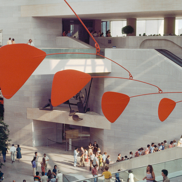
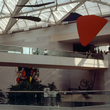
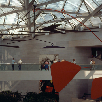
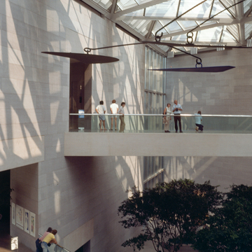
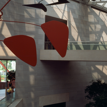
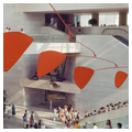
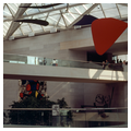
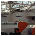
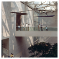
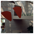
The disjuncture between the exterior and interior begin with the dichotomy between the symbolic entry and actual access to the museum. The progression from street to plaza to covered porch gradually draws the visitor to a wide glass wall where one expects numerous choices, only to be funneled through two revolving doors. Immediately one is in a low, dark, and undefined space from which one is drawn forward by the intensity of light. The atrium is an explosion of light-filled multidimensional space in direct contradiction to the closed and formal exterior. Movement is the leitmotif: Alexander Calder's mobile slowly revolves; shadows cast by the skylight fade and intensify; people move along bridges, stairs, and escalators. Visitors are therefore invited to walk around, explore, and experience the building as incoherent fragments rather than a whole object. Unlike neighboring neoclassical structures, whose organization and purpose is evident, the East Building must be actively engaged and deciphered.
In late-twentieth-century museums, cultural and historical artifacts are a form of consumerism for much larger and better-educated audiences than at any other period in American history. Pei's East Building responds to this phenomenon on many levels. The atrium serves as the traffic artery for large crowds moving among numerous exhibition spaces. At the same time, it serves as a public park with trees, benches, and sculpture. Most of all, it is a space of great architectural potency meant to excite, to give a sense of place. To misquote Gertrude Stein: there is there there. Within the atrium, no two circulation modes are the same, forcing visitors to be actively involved with the building as they move through it. In contrast, most of the galleries are subdued, perfect foils for the display of painting and sculpture. The result of this architectural self-consciousness is that the building vies with its contents for aesthetic supremacy.
To achieve his dramatic effects, Pei advanced architectural technology in many areas. The tetrahedral skylights are composed of brushed chrome tubes laminated between two layers of glass and set within a steel space frame. They introduce light and control the interior climate, reducing glare, melting snow, and admitting fresh air to the intake system. The high-quality craftsmanship of the building is the result of careful planning of details and customized elements. The 3-inch-thick marble veneer panels (2 feet by 5 feet) were hung by steel plates on the cast concrete core. This allowed for custom cutting of corners, as in the acute angle of the study center on 4th Street. Neoprene gaskets instead of mortar joints between the marble panels allow for expansion and contraction and are maintenance free. Marble dust was mixed with the concrete aggregate to harmonize the two materials.
The East Building addition to the National Gallery received numerous accolades from the architectural community. Even the conservative critic Hilton Kramer noted that “the National Gallery has given us an exemplary symbol of our democratic culture at its best.” And indeed, the structure has remained a pillar of modernist monumentality of the Mall, defying periodization and instead remaining a symbol for democratic culture and civilization.
References
Kopper, Philip (ed.). America’s National Gallery of Art. Princeton, NJ: National Gallery of Art/Princeton University Press, 2016.
Nitzan-Shiftan, Alona. "Toward a Modernist Civic Monument: Pei’s East Building and the City of Washington.” In Anthony Alofsin (ed.), A Modernist Museum in Perspective: The East Building, National Gallery of Art, 125-148. New Haven, CT: National Gallery of Art/Yale University Press, 2009.


