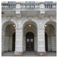
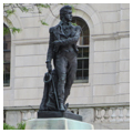
To local residents it is always the “State House,” never the “Capitol,” in deference to the old multi–state house system which prevailed, in theory if not quite in practice, in Rhode Island until this building opened in 1901. A key monument of the American Renaissance, the Rhode Island State House is the product of an elaborate—and probably “arranged”—competition. Its design came from McKim, Mead and White's office contemporaneously with the firm's Beaux-Arts classical work for the World's Columbian Exposition, and the rather unelaborated plans for the integration of the new State House with the central city were among the first applications of the ideals essayed in the “White City.” As the principal designer for the State House, McKim scorned the gaudy and idiosyncratic ornamentation of capitols
As both a type and an ideal, the Rhode Island State House informed the designs of subsequent new state capitols for a generation. Programmatically, the building follows the established domed capitol scheme with legislative chambers to either side. However, the clarity of McKim's massing and plan, together with the “chasteness” of its Renaissance detail at a time when classical propriety had begun to assert its hegemony over Victorian picturesqueness and originality, gave the format new life. If fault is to be found with the exterior massing it would be, above all, in the wings. The projections to mark the legislative chambers are too unemphatic in wings a bit too long, which equally unemphatic detail emphasizes. (In the original design the wings were more compact, but with uniform windows which muted exterior articulation of the legislative chambers.) As a result of the extended wings, the centerpiece with its dome does not so much build from the mass below as interrupt a bland expanse of wall in a sudden eruptive ascent.
On the inside, the most dramatic aspects of the building are the trapezoidal-plan entrance halls and the central stair. Wide toward the outer walls, narrowing toward the stairs, the halls funnel the visitor from the north and south entrance fronts of the building to flights which make a pyramid of stairs within the rotunda. These rise to a landing, elevated in the center of the space between the ground and legislative floors, then break at right angles into another pair ascending east and west toward the two chambers. Actually, the space possesses some of the quality of a tight vertical shaft characteristic of Victorian staircases, a verticality which the raised stair landing halfway between the principal floors partially mitigates by raising the floor below the dome well above the ground level. The severe ornamentation of white marble in the lower portions of the space gives way to the lively color of coffers and murals in the upper reaches of the space and dome, the latter of which received the planned mural decoration only in 1947 with The Settling of Providence, by James Allen King. (The virtues painted in the squinches below the dome are apparently of earlier date.) What surely accords with McKim, Mead and White's intentions are the coffers in green and gilt, as well as the corridors in Pompeian red, gray, and ochre. The architects must have expected that sculpture would go into or onto places in the lower zone of the staircase which seem designed for it and appear a bit bare compared to the ornamentation in the dome above. Working drawings (now in the New-York Historical Society), however, give no indication of any intended embellishment for this part of the building.
The centrality of the elevated landing between the first and second stories makes one physically conscious of a plan organized around a central point: legislative chambers, House of Representatives and Senate to the west and east respectively, library and the Governor's Reception Room to the north and
The State House library is “leathery” Neo-Renaissance in tan and dull gold, relieved by touches of color in the printers' marks used decoratively in the coffered ceiling. Shelving around the room provides the equivalent of three to four stories of books as its principal embellishment. This space handsomely anticipates the libraries the firm later designed for a series of New York clubs (notably that for the University Club). The Governor's Reception Room, featuring a fine full-length portrait of George Washington by Rhode Island native Gilbert Stuart, shows more glitter, more color, more sumptuousness. It is a major example of Neo-Renaissance taste at a time when the transition from Victorian styles to the full-blown Renaissance Revival had just begun. It is more chaste than Hunt's contemporary Newport interiors, but McKim himself later criticized it (correctly, but too dismissively for such a splendid chamber) for being “pink, white, and gold, too liney, and too ballroomish.” (The decorative schemes for the library and reception room, together with the colors originally specified for the corridors, were restored in the mid- 1990s.)
The south terrace of the State House offers an overview of Capital Center in the foreground, with the old downtown (or Downcity) behind. It also provides a panorama of the dramatic immediacy with which the tiers of College Hill houses and institutions rise out of the city's center, in summer poking through foliage, in winter starkly exposed.


