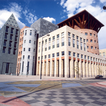
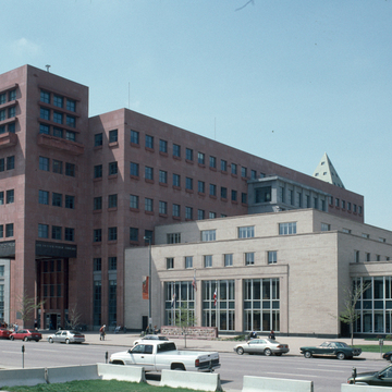
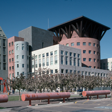
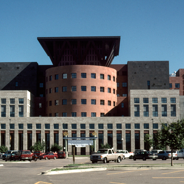
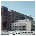
A large semicircular glass bay on the north side of this full-block complex overlooks Civic Center, whose scale, massing, and colors are reinterpreted in the four-story library building of 1955. Its subtle play on classical composition includes two-story window bands representing a glazed colonnade, with third-story fenestration arranged like a frieze. The reinforced concrete frame is clad with Indiana limestone, shot-blasted to raise the horizontal grain. The foundation veneer is polished, dark green Austrian granite.
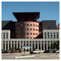
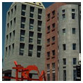
Michael Graves's seven-story addition to the south has a base of banded granite below a south facade of creamy, fossil-encrusted limestone. Upper stories on the east, north, and west are of cast aggregate stone in greenish and reddish tones wrapping rectangles and cylinders. Unlike the classical composition by Robert A. M. Stern also submitted in the design competition, the Graves design does not respond enthusiastically to either the Neoclassicism of the Civic Center Historic District or the 1955 library. Indeed, his building is “medieval” in having clearly articulated masses that express their functions. His village of different colors and shapes ranges from the copperclad children's library entry pavilion to the multi-story pink stone drum housing adult reading rooms. This distinctive drum, a Graves signature, is centered in the set-back, rectangular massing of the south elevation, where Graves comes closest to Neoclassical harmony with his 13th Avenue facade. Changing colors and textures for various elements enliven the massing and highlight the geometrical shapes of the new structure,


