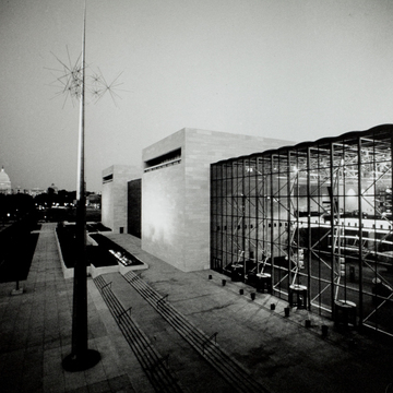
The National Air Museum was established by Congress in 1946, but it was not until the space race of the 1960s that the Smithsonian constructed its museum. While chief architect Gyo Obata of the St. Louis–based firm Hellmuth, Obata, and Kassabaum (HOK) did not have to advocate for the use of modernist aesthetics—it was assumed that the museum’s appearance would reflect the modern space flight—he did have to figure out how to design a structure that would house scores of full-sized air and spacecraft and still fit into the existing architectural context. Obata turned to the airplane hangar for inspiration, and his design earned him and HOK a national reputation.
Obata cites the influence of John Russell Pope's National Gallery of Art in the formal massing, plan, and materials of his design. Facing the Mall are four monolithic blocks that are clad in the same pink Tennessee marble as the National Gallery. They are connected by a bronze glass longitudinal spine that runs the entire 635-foot length of the building and rises through both floors of exhibition space. These alternating solids and voids were placed and proportioned to respond to the corresponding projections and recesses of the gallery that sits directly opposite on the Mall. Equivalent volumes face Independence Avenue, but the recessed, glass-enclosed bays of the Mall facade have been replaced by unbroken floating marble cubes cantilevered to be flush with the south facade to avoid excessive retention of heat. A similar inversion of negative and positive space exists on the two main facades of the Freer Gallery, a short distance to the west. The adjoining Hirshhorn Museum offered a detail that Obata adopted: the long slit of the balconies and deeply recessed windows cut into each block create dramatic black shadows, a kind of inverted cornice line. Again, Obata used negative space as a positive element that is abstractly expressive of what would have been solid in an earlier architectural tradition.
The entire building is raised on a long, low, two-level terrace that provides a solid base for it in the classical manner. Other markedly classical aspects of the Air and Space Museum include its symmetrical composition, entries on the central axis marked by staircases, and its emphatic rectilinearity. The Air and Space Museum's open interiors are legible from the exterior. We know that the high-tech exposed tubular steel truss supports the gray glass walls and ceiling, yet they barely touch. The objects and museum experiences offered were to be very diverse and to encourage active participation by the public, and the spaces had to be designed to accommodate the variety of uses. One- and two-story open spaces, as well as enclosed galleries, theaters, and a planetarium, were mandated; they are served by continuous concourses on both exhibition levels. The direct manner in which Obata approached his architectural problems suggests simple solutions, but the design of the Air and Space Museum is more subtle than it initially appears. The marble slabs were laid with the grain running horizontally, which results in a basket-weave effect and a three-dimensional textured appearance on the planar cubes. The 2-by-5-foot panels are hung as a curtain wall on a steel lattice, rather than as a facing to a precast concrete core. Shadows in the interior are cast not just by the exposed structure but also by planes and rockets suspended from it. Response to changing exterior atmospheric conditions is immediate, as sunny or stormy skies quickly change interior lighting and atmosphere. This interface between inside and outside was intentional, for Obata wished to connect the museum's objects with the element they conquered.
Advances in heat-resistant glass technology allowed Obata to add in 1988 a glass pavilion at the east end for a 1,300-seat restaurant. Although he designed a more plastic form, Obata continued the high-tech interior structure and the same gray glass of the original building in the pavilion.
The museum architecture is complemented with the addition of several sculptural works. Most prominent is Richard Lippold’s 1976 abstract sculpture Ad Astra, meaning “to the stars” in Latin, made of gold-colored polished stainless steel and three clusters of star-like forms. To the side of the building sits Venezuelan sculptor Alejandro Otero's Delta Solar, which commemorates the Inca sun cult and its importance to the development of modern technology. The sculpture was dedicated by president of Venezuela in 1977.
In 2018, the museum began a multi-year renovation effort to upgrade the out-of-date HVAC systems and perform deferred maintenance. The most substantial transformation is the replacement of the Tennessee marble–clad envelope with a material whose life would span 100 years and meet requirements for energy performance and insulation. Also notable is the landscaping that integrates more greenery to the site along with ramps and other technologies of accessibility.
References
“Architectural History of the National Air and Space Museum, 1972.” Smithsonian Institution Archives. Accessed May 12, 2020. https://siarchives.si.edu/.


