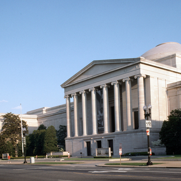
John Russell Pope was an architect for whom refinement and reinterpretation of a few canonical archetypes held greater creative possibilities than invention of new forms. His transformation of the Roman Pantheon as the central motif at the West Building of the National Gallery of Art is only one instance of his reinterpretation of the famous pagan temple. Comparison of the West Building
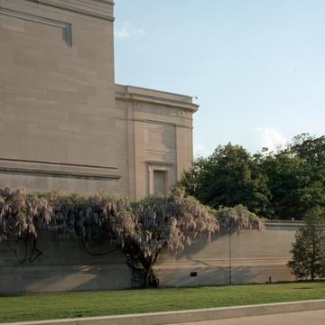
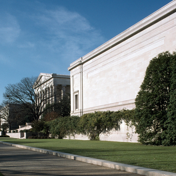
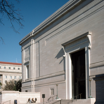
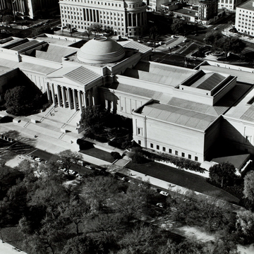
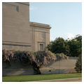
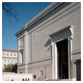
The West Building sits in the center of a two-block-long site removed from its immediate surroundings by high, moatlike walls along its wings on both the Mall and Constitution Avenue sides. In exemplary Beaux-Arts fashion the relationship between plan and elevation is expressed clearly by the exterior volumes. The 782-foot longitudinal spine (31 feet longer than the Capitol) passes through the entire building, intersecting three great cross-axial masses before it emerges from both ends. Shorter parallel setback roofs contain the skylight system for the central sculpture galleries and garden courts. Six distinct rectilinear volumes, unbroken by windows, suggest spaces appropriate for the display of paintings. These volumes are articulated by the traditional horizontal and vertical regulating lines associated with the classical system of ordinance, a complex shallow layering of pilasters, moldings, architraves, and panels. The continuous, unbroken surface of the moat walls tends to concentrate the architectural forces on the porticoes and dome. The linear articulation of the unfenestrated wing walls contributes to this movement, which builds in intensity as the wall surfaces become more densely gridded toward the center of the building. This interplay between the linear and the volumetric, which at first one supposes reveals the influence of modernist geometries on Pope, was present in his earliest work and derived from his interest in Italian High Renaissance architecture.
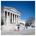
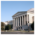
Andrew Mellon chose the pink Tennessee marble, seven shades of which are used on the exterior. The graduated hue from pink at the base to near-white at the cornice is a subtle factor in keeping the huge masses from being too ponderous. The marble is not a veneer but solid blocks of stone. The lightest color was reserved for the dome. An additional color refinement is that the outer columns of the porticoes are a darker hue while those at the center are lighter. From the Mall one ascends a tall, broad staircase to the main entrance portico. Twelve Ionic columns are distributed in two rows, with the inner ones framing three doors. The portico on the Constitution Avenue facade is similar but set high above the street with entries cut into its solid base. Both are simple without being severe, largely due to their attenuated proportions. With the exception of the Ionic order repeated in the rotunda, the more austere Doric is employed for pilasters throughout and for the freestanding columns of the garden courts, as simplification of volumes and surfaces was fundamental to Pope's aesthetic and contributes greatly to the calm ambiance of the museum.
The rotunda of the National Gallery is an interior space of great power. The primary circulation axis of the museum as well as its symbolic core, a double circle of columns, is overlain by a Greek cross with arms of unequal length. Sixteen monolithic 36-foot-tall green Italian marble columns circumscribe the inner circle and carry the limestone entablature and parapet. Double columns mark entry into each of the arms, while empty niches are carved out of the rotunda walls. By attempting to reconcile the dichotomy between circular and cross-axial movement, Pope created a space where access is tightly controlled but movement is constant. Diffused light filling the galleries and portico arms draws one from the rotunda to the circulation pathways, while the width of the Mercury fountain requires deviation from the main axis within the rotunda. The contrast of shiny, dark column shafts against grainy, light walls, dome, and column sculpture is an arresting moment of drama within the serene play of manners which characterizes the museum as a whole. This interplay of light and shadow and of dark and pale materials enhances the complex changing perspectives as one enters and passes through the rotunda. Pope may have intended his rotunda to pay homage to two famous unexecuted plans for the Capitol. William Thornton's 1793 design called for a ring of columns set within his central rotunda, and both Benjamin Henry Latrobe's 1806 and 1817 schemes had large niches set diagonally.
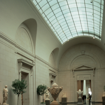
The intensely cerebral nature of Pope's architecture continues in his treatment of materials and architectural details. Contradictions abound. Sleek, thin rusticated walls on the ground story give way to unpolished matte surfaces on the main floor. Architectural details—such as the guttae in the garden court frieze—just appear, apparently from nowhere, as they are not logically connected to the seemingly correct classical system. The marble seems alternately so hard that it can only be used in shallow rectilinear or curvilinear sheets, then so malleable that a thick spiral of it can be molded into a sinuous stair rail–baluster–newel post whose curve sweeps one upward. Interior walls display the same subtle surface modulations as the exterior, with layered shallow planes often merging with the ordinance system as walls become extended pilasters. Decoration is held to a minimum: elongated scroll brackets (reminiscent of those used by the Renaissance architect Antonio de San Gallo the Younger) provide three-dimensional structural ornamentation as architectonic as the rest of the building. The constant interplay of the linear and volumetric is as clear and structured as the plan, the whole a temple not just to display but to enhance the paintings and sculpture it contains.
Decorating each gallery to the historical period and place of the art it was to contain was not Pope's decision but rather that of the gallery's director, David E. Finley. Creation of such modern “period rooms” allied the gallery with American turn-of-the-century museums that collected actual historical rooms. The sensitive ground-story renovation creating a bookstore, café, and sculpture gallery is the work of Keyes Condon and Florance. Completed in 1983, it is thoroughly consonant with the elegance of the original building.


