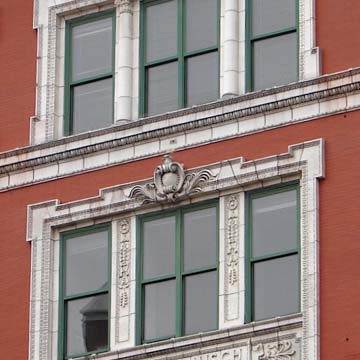
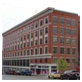
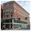
Of all extant Queen Anne commercial facades in the city, the Conrad Building's beautifully restored front for the plain brick box behind is the most ambitious. The first impression it gives is of a multitude of windows, variously shaped and projected, above the handsome regularity of a classic Queen Anne cast iron storefront. Small-paned transoms increase the light into the high interiors and incidentally scale down the shop windows to accord with the horizontality of the street. As with many Queen Anne buildings, the basic compositional scheme is symmetrical, centered in the recessed entrance to the upper floors. An ornamented terra-cotta arch at the second-story level accents the entrance. Above it a
These exotic touches probably represented the client's taste, since they are nearly unique in the architect's work. Jerothmul B. Barnaby was a self-made millionaire from his clothing store a few blocks away on Westminster Street. He presented this investment property as a self-renewing wedding present to his daughter and son-in-law. (Is the mysterious bust on the terracotta roundel toward the southern end of the building a portrait of him, of his son-in-law, or of some historical figure?) Barnaby's penchant for the Middle East seems confirmed by a similar tower which the same architects added two years later to his Broadway mansion ( PR186). The Conrad Building was beautifully restored as luxury apartments, but the area was not ripe for gentrification, so the building became a dormitory for Johnson and Wales University students.
By comparison, Caesar Misch's commercial palace is tame indeed. Another example of Neo-Renaissance trim in terra-cotta which is boldly challenged by the logic of the steelframe, plate-glass commercial building, the Misch Building's brick walls give it a more normative look than Harkness's reduction of “walls” to the bare bones skeleton of his Summerfield Building ( PR15).


