You are here
Humana Building
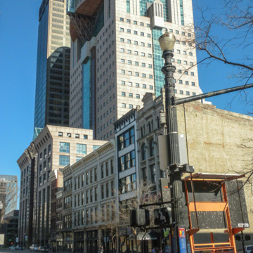
The Humana Tower in downtown Louisville is one of the icons of the Postmodern movement. The building is a successful demonstration of how architecture after modernism can enliven urban space through color, contextualism, and metaphorical references to the larger environment. Time magazine named the twenty-six-story skyscraper one of the ten best buildings of the 1980s and the American Institute of Architects recognized the Humana Tower with its National Honor Award in 1987.
Inspired by the Chicago Tribune Tower competition of the 1920s, Humana took the unusual step of having a competition to select the architect for its headquarters. The other finalists, including César Pelli and Norman Foster, submitted more conventional modernist designs that tended toward the monochromatic. This contrasted with the strikingly polychrome granite-clad design submitted by Graves. As Humana’s in-house architect Robert Harris wrote, “Most of the others could be built in other settings. But Graves’s building was the only one that could be built just in Louisville.”
The design shows sensitivity to its neighboring buildings: five-story cast-iron buildings from the post-Civil War era on one side and, on the other side, the second-tallest skyscraper in Louisville, the forty-story National City Tower, designed in the early 1970s by Harrison and Abramovitz. To relate to the adjacent lower buildings, the front facade of the Humana Building is not only relatively low in height, but mimics the angled cornices of the older buildings. At the same time, the colorful Humana Tower more than matches the dark National City Building for presence, even though it is almost one hundred feet lower than its neighbor.
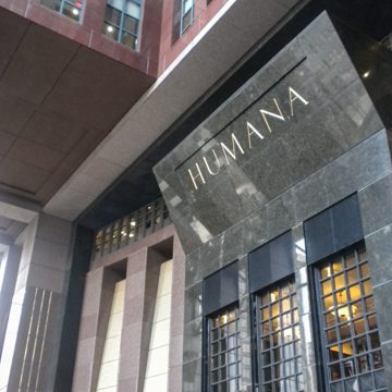
By the time the Humana Building was designed, it was unusual for a skyscraper to make such extensive use of stone. This was partly due to the expense of top-quality stone, but also to the cost of the skilled labor needed to cut, polish, and lay it. Humana’s exquisite use of colored granite is what sets it apart from other colorful Postmodern skyscrapers of the 1970s and 1980s, some of which, including Graves’ own Portland Building in Oregon, seem gaudy in comparison. The Humana Building, in contrast, is both elegant and playful.
The more than 33,000 pieces of granite used in the building came from numerous countries, including Finland (pink), Brazil (green), Angola (black), India (red), and Sardinia (gray). All of the stone was shipped in twenty-ton blocks to the famed Carrara stone works in Italy, where it was cut into custom shapes before arriving in Louisville. The tapestry-like colors of the building seem to shift with the changing light of the day, and at night floodlights keep the building a highlight of the Louisville skyline.
Graves’ design makes reference to two local features: the nearby Falls of the Ohio and the Big Four Bridge, a nineteenth-century railway bridge that crosses the river a few miles away. The Falls are referenced by a fifty-foot waterfall fountain at the entrance within the loggia, while the playful phone-booth-like projection of the observation deck on the twenty-fifth floor, with its steel support, references the structure of railroad bridges. As Graves wrote, “The waterfall is a strong element in that gesture toward the river, and the porch…supported by a great armature of steel, is certainly a metaphor of the crossing of the river.” The lobby makes reference to the Roman Pantheon with alternating round and square stone patterns on the floor and a faux oculus in the lobby ceiling. Classical statuary set in niches adds to the effect of a building that has a rich relationship with history.
Inside and out, the Humana Building has a three-part design. The six-story lower portion, which is related on the exterior to the adjacent cast-iron buildings, houses a cafeteria and the executive offices in addition to the lobby. The other offices are housed in the body of the building, and have 4.5–foot square windows that Graves believed were well scaled to the human body while also increasing the building’s energy efficiency. The top of the Humana Building, which Graves called the “crown,” has a conference center, a theater, a health center, and a spacious projecting porch. Overall, the Humana Tower embodied Graves “figurative architecture,” which he promoted in the 1980s as an anthropomorphic design that moved decisively away from the machine metaphors and abstraction of modern architecture.
The Humana Tower was controversial during its design and construction, and was even derided by some as looking like an over-sized, old-fashioned cash register. Since its completion, it has become one of the most admired skyscrapers in Kentucky and is regarded as a key work of Postmodernism. Architecture critic Paul Goldberger’s 1985 assessment of the Humana Tower in The New York Times still rings true today: “For too long architecture that has taken itself quite seriously has been a deadly bore, and architecture that has been lively has tended to be frivolous. But Humana is neither boring nor silly—it is at once a building of great dignity and a building of great energy and passion.”
References
Arnell, Peter, and Ted Bickford. A Tower for Louisville. New York: Rizzoli, 1982.
Friedman, Julius, and Michael Graves. From the Ground Up: The Humana Building Time-lapse Book. Louisville, KY: Humana Corporation, 1986.
Graves, Michael. Michael Graves: Buildings and Projects, 1966–1981. New York: Rizzoli, 1982.
Writing Credits
If SAH Archipedia has been useful to you, please consider supporting it.
SAH Archipedia tells the story of the United States through its buildings, landscapes, and cities. This freely available resource empowers the public with authoritative knowledge that deepens their understanding and appreciation of the built environment. But the Society of Architectural Historians, which created SAH Archipedia with University of Virginia Press, needs your support to maintain the high-caliber research, writing, photography, cartography, editing, design, and programming that make SAH Archipedia a trusted online resource available to all who value the history of place, heritage tourism, and learning.


